OVERVIEW
Design Your Story
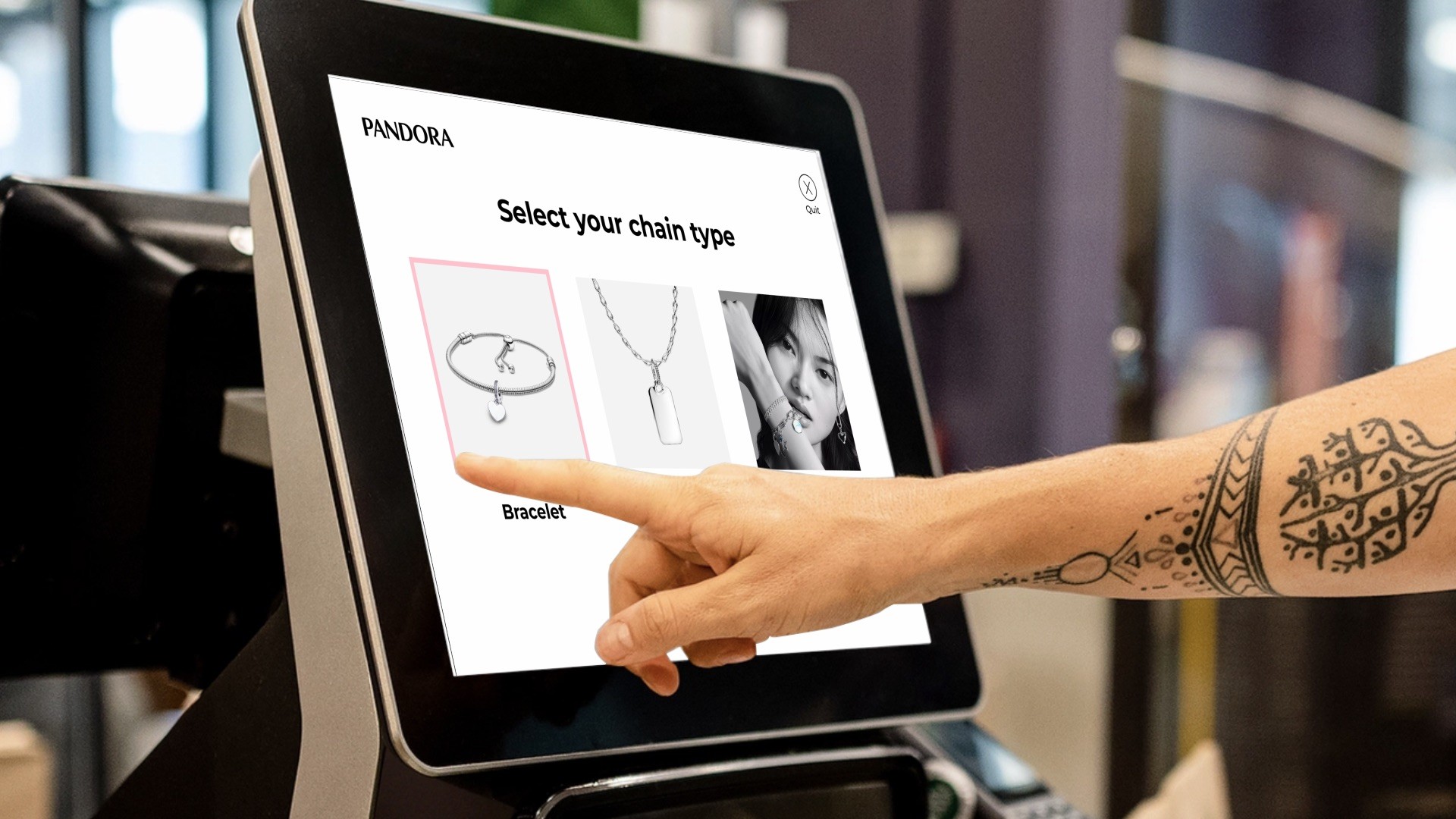
This project is focused on designing an interactive touchscreen kiosk experience for Pandora Jewelry stores. Built around Pandora’s pre-existing product catalog and brand, the kiosk allows users to personalize a charm bracelet or necklace and create customized engraved pieces. This kiosk is meant to serve as a hands-on way for customer’s to feel in control of the design process of their jewelry.
CONTEXT
Filling a gap in customer service
When you order at a restaurant on a kiosk, the most personal aspect of the experience giving your name, credit card info, and the type of condiment you want in the bag. I wanted to challenge myself and design a kiosk that fills a gap in customer service rather than just facilitate a to-go order. I chose Pandora because of the more intimate culture behind personalizing jewelry plus their large product catalog presented an opportunity for optimization.
The Challenge
Today’s customers expect more control, creativity, and convenience when they shop, especially when it comes to personal gifts like jewelry. In a busy store environment, it’s easy for shoppers to feel rushed or unsure about all their customization options.
My solution
A hands-on, self-guided experience that helps users visualize their designs, explore different options, and make confident choices without needing to wait for a salesperson. This not only improves the customer experience but also helps Pandora drive more customized sales, shorten wait times, and make personalization a bigger and more exciting part of the in-store journey.
SOLUTION
As easy as 1, 2, 3!
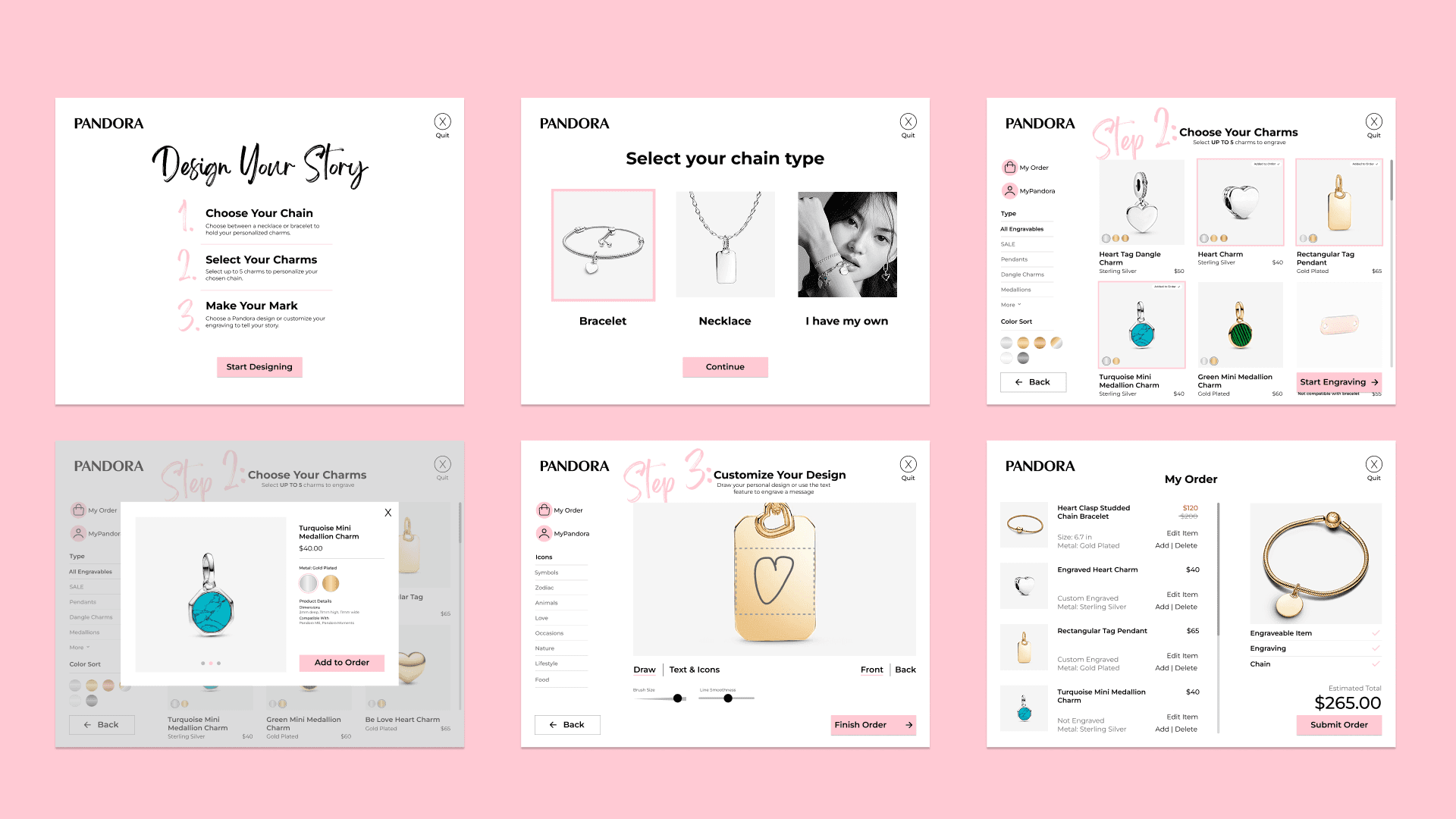
The final flow guides the user through a 3 step process. The steps are based off of existing Pandora marketing around their customization services and adapted for the kiosk experience. I chose to keep this structure for the kiosk for two main reasons.
Taking things slow
Breaking the experience into smaller, bite size sections ensures users take their time when making decisions. This keeps the experience personal and reduces the chances of user error.
Mirroring Human assistance
The gentle guidance of the 3 steps mirrors the type of service traditionally provided by a in-store associate. The kiosk isn't meant to be the faster store option, but an alternative option that emulates a personalized experience with an associate as close as possible.
Final Prototype
PROCESS
Translating the existing brand
Pandora has a very recognizable brand and I wanted my kiosk to feel like a part of their ecosystem. I mainly used their store website as a reference for colors, text styles, image treatments, and even overall layout decisions. The challenge was translating a cursor based design into components that were based on finger size so that the elements were tappable. I also introduced a side navigation to make filtering easier and faster.
Mapping the user flow
In order to make sure I accounted for each possible flow the user could go through, I mapped every decision point, error state, and system response in the kiosk, including what happens during inactivity . I did this for the main flow that was prototyped, but I also diagrammed the global elements that exist across every screen: cart access with delete, edit, and swap options, order cancellation with a confirmation step, inactivity timeout with countdown and auto-restart, and the full checkout flow covering both same-day pickup and delivery paths. These were the details most likely to get skipped in a first pass, and mapping them early meant I was not solving edge cases in the middle of building wireframes.

What was left behind?
I also mapped a diagram for an alternative experience for the kiosk where a user could customize a charm bracelet or necklace. This version allowed the user to select a group of charms and then visualize them on the desired chain of their choice. Ultimately, I left this option out of the final prototype as it was beyond the scope of the project. In the future, I'd like to return to this idea and build out the full flow.
OUTCOME
What I learned!
Pandora's catalog is enormous, and the in-store experience has never really done it justice. I wanted to design something that gave customers the time and control to actually explore it without needing a salesperson to guide every decision. Getting that step-by-step flow to feel intuitive rather than rigid was the core challenge of the whole project.
I came out of this one with a much stronger grasp of systems-level thinking. Mapping every error state and edge case before touching visual design is not something I had done at this scale before, and it changed how I approached the screens that followed. The spacing and micro-animation work still has room to grow, and I know it. But the bones of this project, the logic, the constraints, the flow, are ones I am genuinely proud of.