OVERVIEW
A Modern Identification System
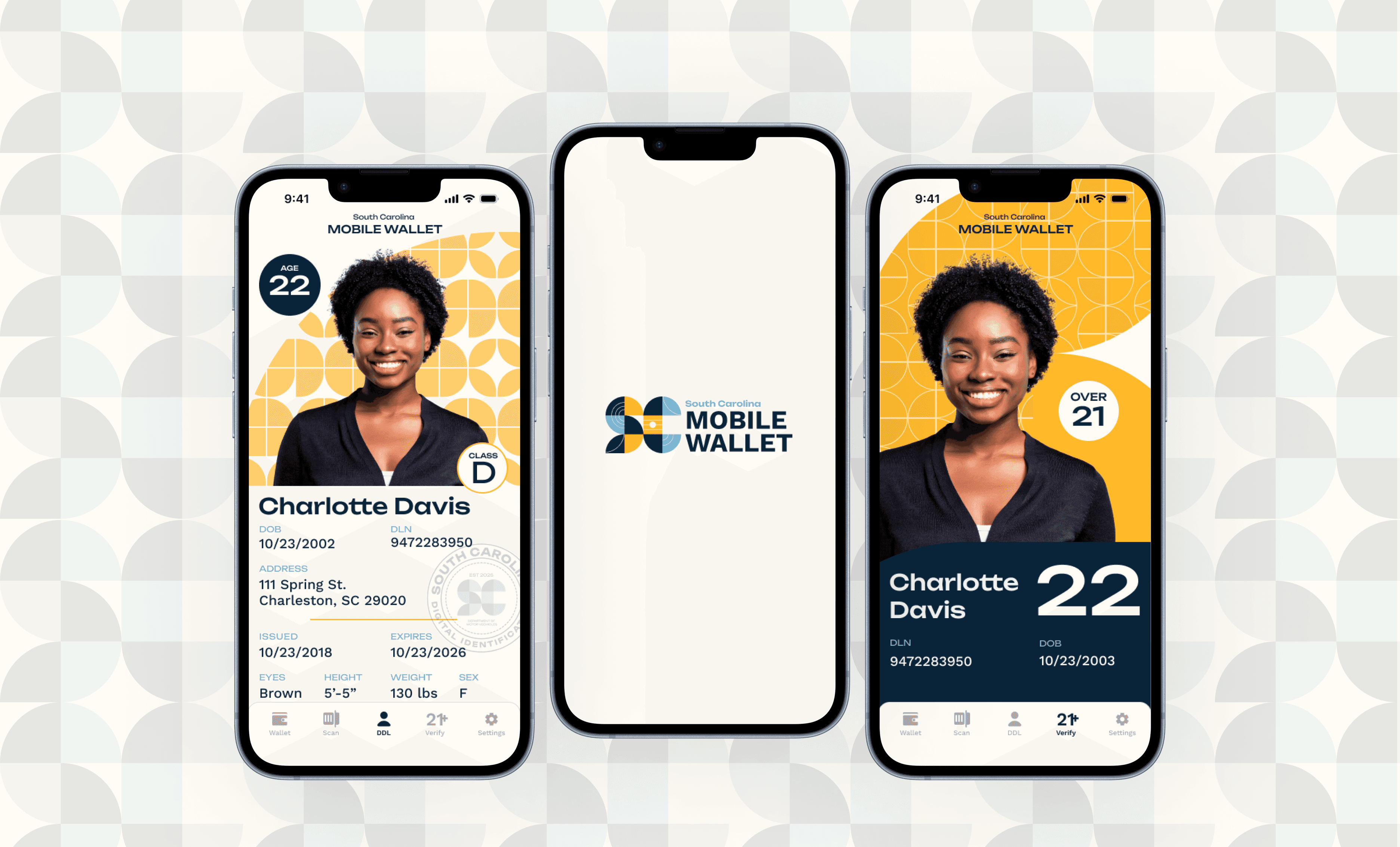
This SC Mobile ID concept transforms a standard state driver's license into a user friendly mobile application. Inspired by real-world attempts at this concept, my goal was to create an experience that balanced strong branding and usability.
The Challenge
Traditional driver’s licenses are designed for physical verification but do not seamlessly translate to digital environments. Key challenges include maintaining security, accessibility, and clarity while ensuring a user-friendly experience on mobile devices. A poorly designed digital license could lead to usability issues, security concerns, and a lack of visual cohesion with official government branding.
My solution
A digital license that is structured to enhance readability, security, and ease of use. The design leverages clear typography, intuitive layout, and visual elements inspired by South Carolina’s culture to create an engaging yet functional experience. Interaction models ensure smooth verification and access, making the transition from physical to digital seamless and efficient.
Final Prototype
CONTEXT
Why South Carolina?
This project was mainly an exercise in branding, UI design and prototyping. I could have chosen any state to base the designs on, but I felt that I'd make the best design choices for the state I know best - my home state of South Carolina! As a designer, I strongly believe that the best work comes from a place of love and familiarity. I wanted to center other SC natives as the users and design a product that they would resonate with and be proud to use.
PROCESS
Room For Improvements
I first looked at existing digital identification cards and found plenty of room for growth both aesthetically and functionally. I looked at 3 products (Apple Wallet, California mDL, & Colorado Digital ID) to find the oppurtunities for improvments in digital ID applications.

Enhanced Branding & Identitiy
I needed to create a recognizable visual identity that was both unique to the state I was designing for and goes beyond designing a replica of a physical identification card.
Secure Information Display
My product should utilize thoughtful photo treatments that are visually pleasing and increase overall visibility.
Improved Photo Presentation
How can I design for authentication? I needed to create a way to control visibility of sensitive data and security feature to prove a card is not counterfeit.
Iterating Fast and Early
I like to create multiple approaches to a project early on. I mostly iterated on the layout of the main ID screen to try out different ways of presenting the information. This was an important part of the process because it made me think critically about what information demanded more attention than others. Age? Name? Photo? What information would a user want to see first?
Style Development
Finding Visual elements and motifs
In order to create a strong visual brand for the state of South Carolina, I explored the state's cultural and visual identity, incorporating elements such as state fauna, colors, and traditional crafts to create a distinctive and regionally relevant design.

Moodboards and applications
I explored two different styles that I felt aligned with the aesthetics of the state.
Coastal Vibrance Pattern Moodboard
This direction focuses on the state’s lively coastal environment. Additionally, it incorporates patterns that replicate the look of sweetgrass baskets that are a cultural craft in the state.

Sunset gradient Moodboard
This direction takes inspiration from the state’s flag color as well as state flower. Combining those colors, the aesthetic was aimed towards the feeling of a summer sunset, emulating the feel of a South Carolina beach.
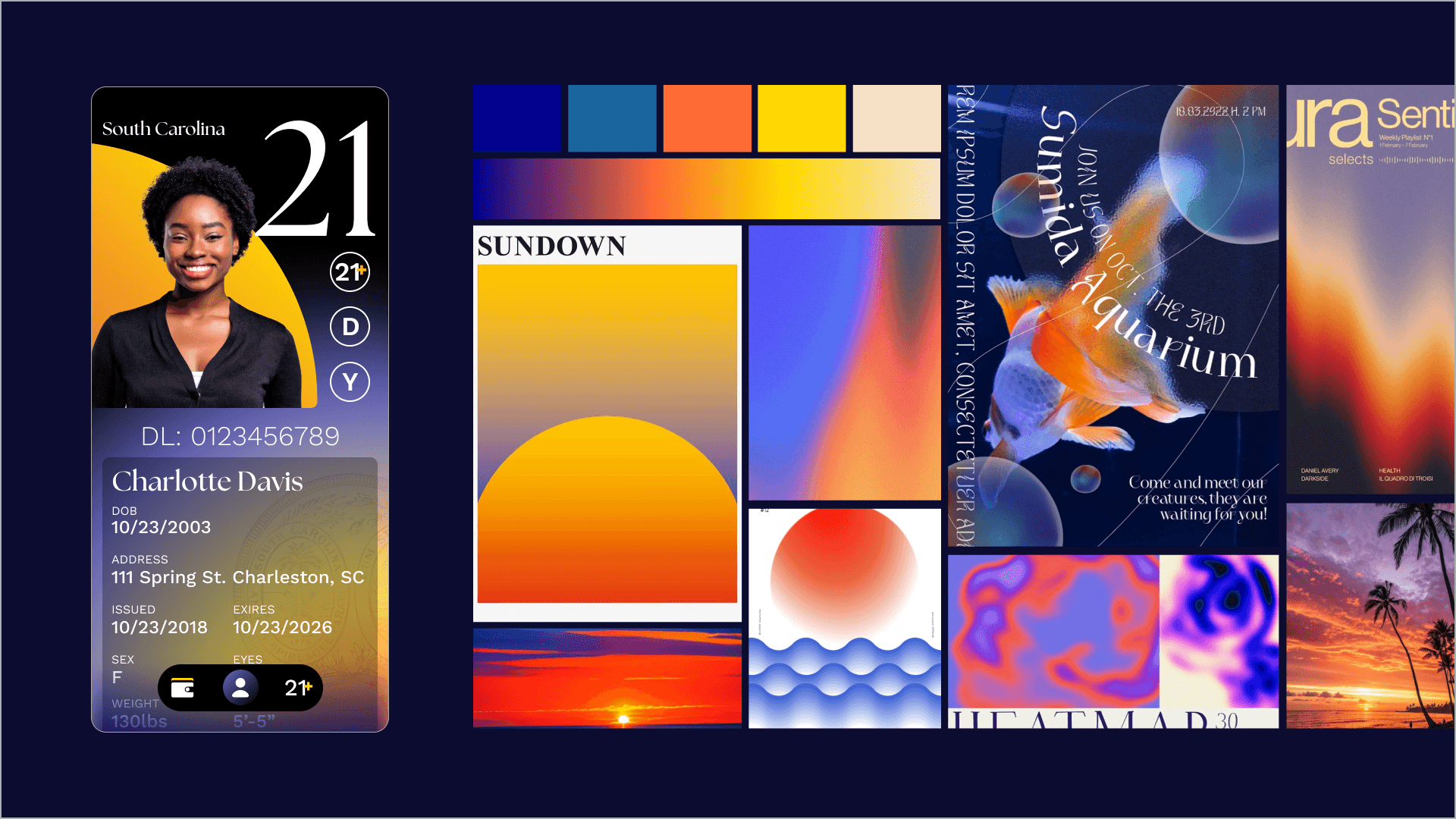
Final direction choice
The ultimate deciding factor between the two styles was whether I wanted a friendly or more sophisticated approach. I ended up choosing the lighter, pattern focused style and after a few iterations, I brought in some of the elements of the second visual direction to create a blend between the two.
Pattern & Logo exploration
Woven sweetgrass baskets and crafts are a staple of the Gullah Geechee people who live in the coastal lowcountry of South Carolina. Growing up, their art always reminded me of the state. Since they are also residents of SC, I wanted to represent them by incorporating woven patterns into the branding. I explored different pattern variations for both background elements and the app logo.


Final Styleboard

Applied Style Evolution
While developing the final visual style, I also iterated on the layout in parallel. When I'm designing, it is easier for me to test out different visual directions in the intended format so that I can get a better idea of what actually works well. These are a few of the iterations I went through while figuring out the branding. In the end, I think the layout was more dependent on the branding decisions rather than applying the branding to a single layout.

Prototyping
The final flow is prototyped in Figma. I wanted to include micro-animations on top of the straightforward smart animate prototyping options, so I challenged myself to make animated components in Figma. These were made before Figma Motion and are basically frame by frame animations.
Full Flow
Solo Animated Components
SOLUTION
Final Designs
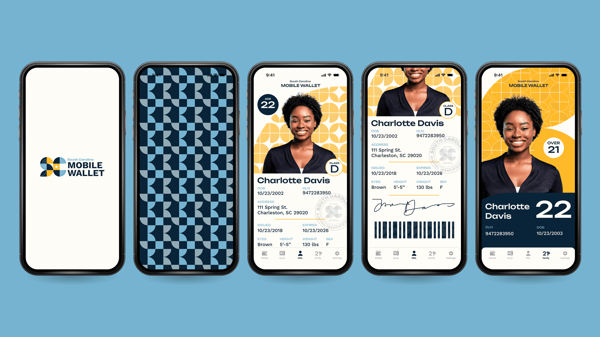
Splash Screen
The animated splash screen briefly shows detailed branding with a punchy color palette. The pattern animation acts as a way to sweep the user into the ID page as an introduction to the overall aesthetic of the rest of the application.

Full Info View
The full view screen is easy to scan for important information because of the high contrast color palette. The state brand is developed in this screen via the pattern in the background.
A state seal in the background creates an authentic and official feel to the overall design.
Age Verification
The age verification screen is accessed via the icon in the navigation bar. The simplified layout makes quick verification possible. Additionally, the dynamic pattern in the background acts as a security feature to prove the user is showing the screen in real time.
OUTCOME
What I Learned!
Balancing branding with functional design is essential to creating a digital ID that is both visually appealing and easy to use. Overly complex elements like multi-color navigation, busy backgrounds, and confusing color schemes can hinder usability. Instead, purposeful patterns and illustrations can enhance the design without overwhelming it. Intentional use of branding elements ensures clarity and cohesion and sometimes, the best approach is to simplify and go back to the basics for a cleaner, more effective user experience.